Best Concrete Logo Design Ideas
Benjamin Marc creates the best construction logo design images
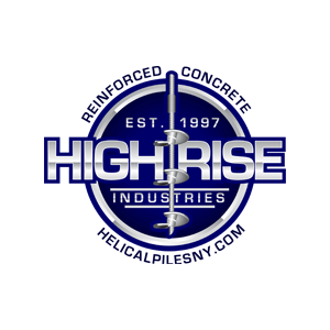
High Rise Industries are helical pile contractors, specializing in reinforced concrete footing, piers, underpinning, poured concrete foundations, and more. The owners of High Rise Industries sought out Benjamin Marc to revitalize their company image. The wanted to create a new construction logo design that is pure perfection. High Rise Industries was also looking to hire a local printing company for their stationary.
High Rise Industries’ logo is an impeccable visual representation of the company’s work and values. The designers and company carefully chose a color scheme that is catchy, yet professional. Using royal blue, which blends into navy and black provides the ideal canvas for the gray lettering and graphics. It reflects the strong and solid foundations High Rise constructs, as well as its very own reputation. Benjamin Marc’s innovative designers create the font and graphics in a combination of grays. This resemble steel, framework used in construction.
In a recent blog post CEO, Anthony Savino said. “I set out to design the best construction logo design and we achieved that goal”.
The company name, “High Rise,” was also designed in a bold font that emphasizes the architectural nature of the work. Benjamin Marc also incorporated the establishment date, in order to highlight the incredible amount of industry experience.
The main concept of the graphic design, while it may only look like a circle, also takes on the role of a stamp or seal. This seal, however, does not conform to the standard seal of approval or seal of authenticity. Instead, High Rise’s seal is completely unique; while it does convey their elite level of professionalism, and certification. It also appears as if their seal has been stamped in concrete or steal, therefore being permanent.
Adding an interesting flare and artistic appeal to the construction logo design, is a graphic of an auger, running down the center of the image. The auger is clearly depicted as one used for heavy-duty, professional level work.
High Rise Industries’ concrete company logo is relatively simple, yet somehow appears to be intricately complex. The color-scheme, font, and choice in graphics are all used to effectively portray everything the company stands for. There are truly no words to express the sheer genius in design.
Together, High Rise Industries and Benjamin Marc worked together to create a finished product.
Leave a comment:
You must be logged in to post a comment.